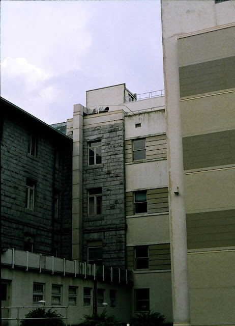
I am completely fascinated by the architectural eras mashed together on the Vancouver General Hospital property. The very distinctive styles of varying decades seem to just meld together to the point that it is hard to distinguish where an original building ends and a new addition begins. This is not because they have managed to string these buildings together seamlessly, but rather because they are so strangely jammed together that it is hard to picture how one could have conceptualized such a "renovation".
Unfortunately I don't know if I was really able to capture the disjointedness of these buildings very well here, but if you are ever in the neighborhood, just look around and try to pick out all the different decades (kind of like an architectural eye-spy... "I spy with my little eye some hideous 70's design structure").
All photos taken with my Olympus Pen F.


No comments:
Post a Comment